

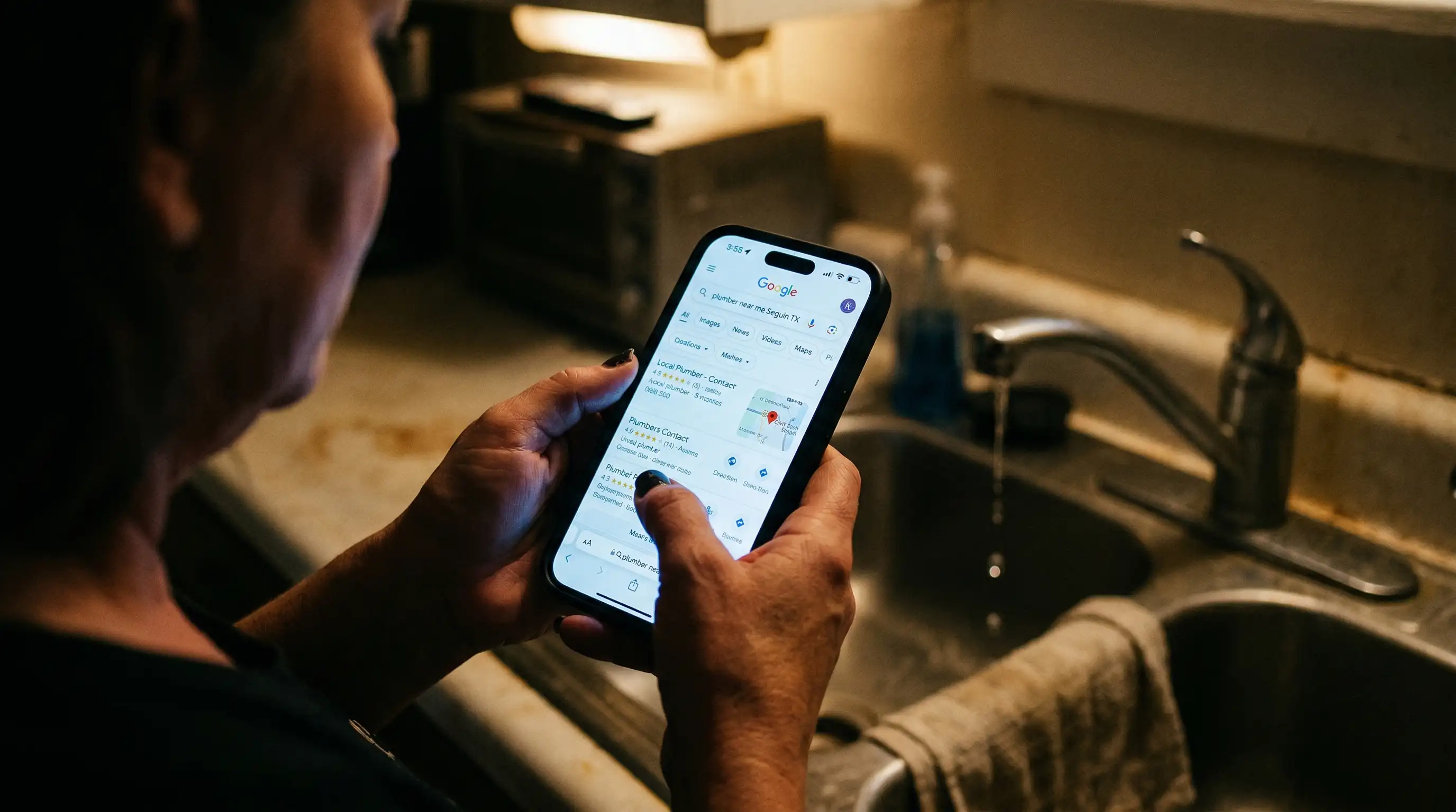
Pull out your phone right now. Go ahead.
Now visit your business website.
How long did it take to load? Did you have to pinch and zoom to read the text? Was the menu a nightmare to navigate? Did the contact form even work?
If you cringed at any point during that exercise, you’re hemorrhaging customers every single day.
The Mobile Takeover Nobody Talks About
Here’s the data that should keep you up at night: mobile devices account for 63% of all web traffic in the United States as of 2024. For local businesses, that number often exceeds 70%.
Think about that. Seven out of every ten people looking for your services right now are doing it from a phone.
And if your website looks like garbage on mobile? They’re gone in 3 seconds. Straight to your competitor’s site.
Small Businesses Get Hit Hardest
The irony is brutal: small businesses need mobile traffic the most, but they’re the least prepared for it.
A recent study by Google found that 61% of users are unlikely to return to a mobile site they had trouble accessing. Worse? 40% will visit a competitor’s site instead.
For a local contractor, restaurant, or service provider, that’s not just a stat. That’s a customer who called someone else. That’s revenue that went to your competition because your website didn’t work on a phone.
The Real-World Impact: What Mobile Optimization Actually Changes
Let’s get specific. Here’s what happens when a small business fixes their mobile experience:
Bounce rates drop by 35-50%. That means people actually stay on your site instead of clicking away in frustration.
Lead form completions increase by 160%. When a contact form is easy to fill out on a phone, people actually fill it out.
Time on site doubles. Visitors read more pages, look at more services, check out your gallery. They’re actually learning about your business instead of rage-quitting.
Local search rankings improve. Google’s algorithm has been mobile-first since 2019. If your site isn’t mobile-optimized, Google literally ranks you lower in search results.
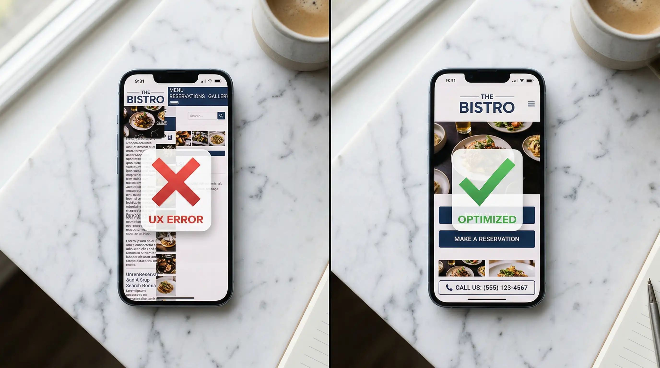
What “Mobile-Optimized” Actually Means
This isn’t about making things smaller. It’s about redesigning the entire experience for how people actually use phones.
Responsive design: Your site automatically adjusts to any screen size. Text is readable without zooming. Buttons are big enough to tap with a thumb.
Fast loading: Under 3 seconds. Every second of delay reduces conversions by 7%. On mobile, people have zero patience.
Touch-friendly navigation: Menus that work with thumbs, not cursors. No tiny links packed together. No hover-based navigation that doesn’t exist on touchscreens.
Click-to-call: Your phone number should be tappable. One click should dial it. Not copy-paste gymnastics.
Simplified forms: Every extra form field on mobile reduces completion rates by 5-10%. Ask for the minimum. Name, phone, that’s it.
Readable content: Short paragraphs. Larger font sizes. Plenty of white space. People skim on phones—make it scannable.
The Numbers Don’t Lie
Businesses that prioritize mobile optimization see measurable results:
- 94% of people with local intent on smartphones visit or call a business within 24 hours
- 78% of local mobile searches result in an offline purchase
- Mobile-friendly sites appear higher in local “near me” searches by an average of 15 positions
- 53% of mobile visits are abandoned if a page takes longer than 3 seconds to load
For small businesses, where every lead counts, those numbers represent real revenue.
You’re Competing Against Everyone’s Phone
The real competition isn’t other websites. It’s everything else on someone’s phone.
Text messages. Social media. Email. News. Games. Every app is designed by teams of PhDs to capture and hold attention on a 6-inch screen.
Your website shows up in that environment. If it looks like a desktop site crammed onto a phone, with tiny text and broken layouts and buttons that don’t work, you’ve already lost.
The Mobile-First Reality
Here’s what most business owners miss: mobile optimization isn’t about “also working on phones.”
It’s about being designed for phones first, desktop second.
Because that’s how your customers live. They’re not sitting at desks researching contractors. They’re standing in their flooded basement, searching for a plumber on their phone. They’re stuck on the side of the road, looking for a tow truck. They’re at the kitchen table after the kids go to bed, finally getting around to finding someone to fix the fence.
Your website needs to work in those moments. On a phone. In poor lighting. With one hand. While stressed.
What To Do About It
If your website isn’t mobile-optimized, here’s your action plan:
Test it yourself: Pull out your phone. Visit your site. Actually try to use it. If you struggle, your customers definitely struggle.
Check your analytics: Look at your mobile traffic percentage. Look at mobile bounce rates. Look at form completions by device. The data will tell you exactly how much this is costing you.
Fix it: This isn’t optional anymore. It’s infrastructure. Like having a working phone number or a physical address.
A mobile-optimized website isn’t a luxury feature for small businesses in 2026. It’s the baseline expectation. The price of entry.
Your competitors are figuring this out. The question is whether you’ll figure it out first, or whether you’ll keep losing customers to businesses whose websites actually work on the device people use.
The next person searching for your services on their phone—will they become your customer, or your competitor’s?
Your website decides. Make sure it’s making the right choice.
Ready to stop losing customers to a broken mobile experience? Let’s talk about what a properly optimized website could do for your business. Because your next customer is already pulling out their phone.